A haunted house Halloween coloring page gives you more than a building to fill in. Windows can hint at a story, a crooked path can guide the eye, and a single moon can change the whole mood. If you are looking for haunted house coloring pages, start by choosing the feeling you want: friendly and cozy, old-fashioned and mysterious, or full of intricate details for a longer coloring session.
The best page is not necessarily the most complicated one. A clear silhouette and a few strong features — a leaning roof, a bare tree, a lantern, or one bright window — can make a memorable scene at any skill level. This guide explains how to select a design, build a simple Halloween palette, and print or color the illustration comfortably. For more scene ideas, explore our complete guide to Halloween coloring pages by theme.
Choose the right kind of haunted house page
Before you think about color, look at how the design is organized. Can you quickly tell where the house ends and the sky begins? Is there a main feature that catches your eye? Does the level of detail feel inviting, or does it look like more than you want to color today?
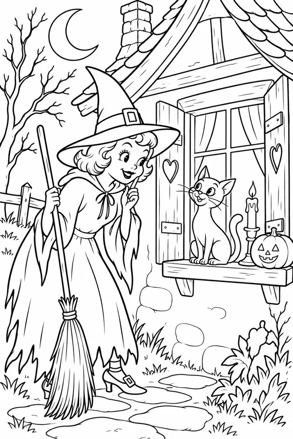
- For younger children: choose a large house shape, bold outlines, open windows, and a few familiar details such as a moon, pumpkins, or a friendly cat.
- For a quick seasonal activity: look for one focal subject and plenty of open areas. A simple cottage, gate, or pumpkin-lined path can be satisfying without taking the whole evening.
- For older kids and adults: try a layered scene with roof tiles, shutters, stonework, tangled branches, clouds, and a winding path.
- For cozy-spooky coloring: favor rounded shapes, expressive windows, leaves, pumpkins, and storybook details over sharp or frightening imagery.
If you are choosing for a mixed-age group, offer two or three detail levels rather than assigning pages by age. Our age-by-age Halloween coloring guide has more ideas for matching a page to a person without making the activity feel like a test.
Build a moonlit palette with a warm focal point
Night scenes often become muddy when every surface is colored with the darkest pencil. Instead, use a few cool colors for the house and sky, then save a warm color for the places that should feel illuminated. The windows, a porch lantern, a pumpkin, or the crescent moon can become the visual center.
Try this five-color starting palette:
- Midnight blue: sky, roof shadows, and distant trees.
- Dusty plum: soft shadows and the side of the house turned away from the moon.
- Smoky gray: stone, bare branches, and the path.
- Warm cream or muted gold: windows, lantern light, and a few stars.
- Pumpkin orange: one or two autumn details that connect the scene to Halloween.
Keep the light source consistent. If the windows glow, let the nearby wall stay warmer and make the far side cooler. If the moon is the main light, leave a pale edge on the roof and branches. You do not have to shade every object; a few deliberate contrasts are usually enough. For additional combinations, see our Halloween palette guide.
Color the house as a story, not a flat shape
Start with the largest areas: sky, walls, roof, and ground. Use light pressure so the printed line art remains crisp. Then add a middle tone to the sides of the building and darker color beneath the eaves, porch, and window frames. Leave the brightest areas near the windows or lantern until the end.
- Set the time of night: a dusky purple sky feels gentle; a deep blue sky feels more dramatic.
- Separate the silhouette: make the roof or trees slightly darker or lighter than the sky so their outlines remain readable.
- Give the walls texture: use a few broken strokes for old wood or stone instead of coloring every section uniformly.
- Light selected windows: color the panes in warm cream or amber and add a soft neighboring tone to suggest a glow.
- Finish the path and foreground: repeat a color from the house or pumpkins so the lower part of the page feels connected.
Colored pencils work especially well for gradual shadows and warm window light. Use gentle layers, and deepen only the areas where forms overlap. Our practical guide to coloring Halloween pages with colored pencils explains how to layer without pressing too hard.
Make it vintage, playful, or dramatic
The same haunted house outline can tell very different stories. A vintage postcard look uses softened colors such as brick red, parchment, faded teal, and olive. A playful page might put a purple roof over a bright orange door and add candy-colored pumpkins. For a more dramatic scene, limit the palette to charcoal, blue-violet, and a few gold windows.
Small details make the mood personal. Add a tiny wreath to the door, glowing eyes behind one upstairs window, a trail of leaves, or an unusually bright moon. If a design feels too busy, skip some details. If it feels too simple, invent a pattern for the roof or add a decorative border. Our article about the details that make Halloween art feel vintage explores how little marks can make an illustration feel lived in.
Printing and setup tips
If you are working from a printable file, check the page size before printing. US Letter and A4 differ slightly, so use “fit to page” when you need the whole illustration inside the margins. Print one test copy, make sure the outlines remain clear, and place a spare sheet underneath if you plan to use markers. Colored pencils and crayons usually need less preparation.
For the best experience, choose a page that suits the time you have. A dense mansion scene can become a multi-session project; a simple cottage can work for a short creative pause. For more on paper sizes, printer settings, and clean outlines, read our printable Halloween PDF guide.
Frequently asked questions
What should I look for in a haunted house Halloween coloring page?
Choose a clear focal point, readable outlines, and a level of detail that suits the colorist. Large shapes work well for young children, while layered roofs, windows, trees, and paths suit older children and adults.
How do you color a haunted house at night?
Use cool blues, violets, or charcoal for the sky and house shadows, then reserve warm yellow, amber, or orange for a few windows, lanterns, or pumpkins. That contrast suggests light without making every area dark.
Can haunted house coloring pages be cozy instead of scary?
Yes. Friendly details such as rounded windows, pumpkins, cats, leaves, and a soft moon make the scene feel more storybook than frightening.
What colors work well for a haunted house?
Try midnight blue or plum, smoky gray, warm cream, muted gold, and pumpkin orange. Repeating a few colors across the sky, windows, leaves, and decorations makes the page feel cohesive.
Find a scene worth coloring.
Explore vintage Halloween illustrations and color one atmospheric page at a time on iPhone.