The right palette can change the entire personality of a Halloween coloring page. The same witch, pumpkin field, or black cat can feel bright and playful in pumpkin orange, mysterious in midnight blue, or like a treasured old postcard in softened vintage tones. Color is not simply the last step after the drawing. It is the atmosphere, the time of day, and often the story.
In this guide to Halloween coloring book color palettes, we will look at three dependable directions: the warmth of pumpkin, the drama of midnight, and the nostalgia of vintage autumn tones. You will find practical combinations, advice for balancing light and shadow, and examples for different kinds of pages. If you are choosing a page for a quiet evening, our guide to the best Halloween coloring pages for a relaxing autumn evening is a natural place to begin.
Why color palettes matter in a Halloween coloring book
A palette gives your decisions a relationship. It tells you which areas should stand forward, which details should stay quiet, and where the eye should rest. Without a plan, it is easy for every pumpkin, leaf, window, and ribbon to compete for attention. With even a simple palette, the page begins to feel collected.
This does not mean that every page needs strict rules. The joy of coloring is personal choice. A palette is a starting point, not a test. It can help you begin when the blank page feels intimidating, and you can always break it when a different color feels right.
For more on why limited colors work so well with old-fashioned illustration, read why vintage Halloween art still feels so modern. The same principles apply to a digital coloring book: clear silhouettes, intentional contrast, and a little room for mystery.
Palette one: pumpkin orange and harvest warmth
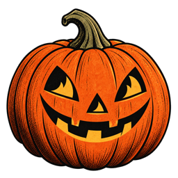
The pumpkin palette is the most immediately recognizable Halloween direction. It is warm, welcoming, and full of the feeling of a porch light coming on at dusk. It works particularly well for pumpkin patches, harvest still lifes, smiling jack-o'-lanterns, witches' accessories, and scenes with falling leaves.
A classic pumpkin palette
- Pumpkin orange: the hero color for pumpkins, scarves, leaves, and small points of light.
- Cinnamon or terracotta: a darker orange that adds depth without becoming harsh.
- Warm cream: a gentle light color for paper, clouds, windows, and highlights.
- Moss green: a natural counterpoint for vines, stems, grass, and leaves.
- Charcoal: the grounding dark for fences, outlines, roofs, and evening shadows.
The secret to a good pumpkin palette is variation. If every pumpkin is the same bright orange, the field can look flat. Try a pale pumpkin on the far side of the image, a cinnamon pumpkin in the middle, and your brightest orange on the focal subject. Repeating one color in several small details will connect the composition.
This palette also suits the Pumpkin Nights artwork collection, where harvest fields, porch lights, and jack-o'-lanterns can carry most of the visual warmth. Keep the background lighter or less saturated so the pumpkins remain the stars.
Palette two: midnight blue and moonlit mystery
Midnight palettes are quieter and more cinematic. They are a natural fit for witches crossing a moon, black cats on fences, haunted cottages, ravens, bare trees, and any page where the sky matters as much as the characters.
A calm midnight palette
- Midnight blue: the main night color for skies, cloaks, rooftops, and distant hills.
- Dusty plum: a softer shadow color that keeps the page from feeling flat or overly black.
- Old gold: the light accent for moons, stars, candles, and windows.
- Smoky gray: a bridge between the darkest shapes and the paper.
- Muted pumpkin: a small warm contrast that makes the night feel connected to Halloween.
When using a midnight palette, do not make every background area equally dark. Leave a quiet halo around the moon or a pale strip in the sky. This creates atmosphere while keeping the important lines easy to see. A little warm gold against blue can do more work than a page filled with many bright colors.
Midnight colors are especially good for black cat pages. Keep the cat close to charcoal rather than pure black, then use the eyes, collar, moon, or nearby leaves as small accents. You can find more inspiration in the details that make a Halloween illustration feel vintage, especially the idea that one tiny background detail can make a whole scene feel lived in.
Palette three: vintage autumn tones
Vintage tones are softened versions of familiar Halloween colors. They feel printed, tactile, and slightly timeworn. Instead of bright orange, think terracotta. Instead of pure white, think parchment. Instead of a hard black, think charcoal or deep brown.
A vintage Halloween palette
- Terracotta: a faded pumpkin color with warmth and character.
- Parchment: a creamy light tone that makes the page feel like old paper.
- Deep brown: softer than black for branches, furniture, and outlines.
- Muted moss: an earthy green for leaves, vines, and old painted doors.
- Dusty burgundy: a rich accent for ribbons, berries, books, and clothing.
- Faded gold: a gentle highlight for stars, candlelight, and small decorative details.
The vintage palette works best when you allow a little imperfection. Do not worry about making every section evenly filled. Uneven color, light paper showing through, and small differences in pressure can support the feeling of a printed illustration. As we wrote in the story behind our Halloween Coloring iOS App, we love the warmth of old postcards, paper decorations, and familiar images that still leave space for imagination.
How to combine pumpkin, midnight, and vintage tones
You do not need to choose only one palette. The most interesting Halloween coloring pages often combine the three. Use midnight colors for the sky, pumpkin warmth for the foreground, and vintage tones to soften the transition between them.
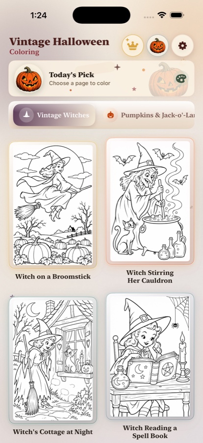
For example, a witch flying across a moon could use midnight blue in the sky, dusty plum in the cloak, old gold in the moon, and muted pumpkin on the hat band. A pumpkin field could combine terracotta pumpkins with moss vines, parchment clouds, and a charcoal fence. A cozy cottage could use deep brown for the wood, warm cream for the window light, and one burgundy door or curtain.
A useful rule is 60–30–10:
- 60 percent: your dominant family, such as cream, midnight blue, or warm autumn brown.
- 30 percent: a supporting family that gives the page structure, such as orange, moss, or plum.
- 10 percent: the accent that attracts attention, such as gold, bright pumpkin, or burgundy.
The numbers do not need to be exact. They simply remind you that a page feels calmer when every color does not shout at the same volume.
Choosing colors for different Halloween subjects
Different subjects suggest different color decisions. A witch's hat can carry a bold accent, while a moonlit landscape benefits from more quiet space. Here are a few reliable starting points:
- Witches and spell books: plum, charcoal, old gold, parchment, and one surprising green.
- Pumpkins and jack-o'-lanterns: pumpkin, terracotta, cinnamon, moss, cream, and charcoal.
- Black cats: charcoal, dusty blue, muted lavender, old gold, and a small rust accent.
- Haunted houses: midnight blue, smoky gray, deep brown, warm window light, and faded burgundy.
- Ghosts and friendly creatures: parchment, pale lavender, soft blue, muted orange, and moss.
- Autumn still lifes: terracotta, cinnamon, parchment, burgundy, deep green, and old gold.
If you enjoy choosing a page by mood, our article on 25 Halloween coloring ideas for adults has more scene prompts to pair with these palettes. You can also browse the complete Vintage Halloween Coloring journal for articles about illustration, quiet coloring rituals, and the making of the app.
How many colors should you use?
Start with three colors if you want a very calm page: one light, one dark, and one accent. Add a fourth or fifth color only when the image needs more separation. A limited palette makes it easier to notice shape, texture, and expression, which is one reason adult coloring can feel so restorative.
For a longer session, prepare two versions of the same palette. The first can be restrained: cream, charcoal, and muted pumpkin. The second can be richer: add plum, moss, and gold. If you finish the first version, you can return to the page with a new mood without making the composition feel entirely different.
Make your color palette part of a relaxing ritual
Choosing colors can be the first quiet step of the evening. Put the swatches beside your page, turn down the lights, and decide which color should appear first. You might begin with the largest calm area — the sky, a wall, or a field — before moving toward the smaller details.
There is no need to finish a page in one sitting. In fact, leaving a little unfinished can make the next session easier to begin. If you want to build this habit, our guide to creating a quiet coloring ritual for autumn evenings has simple ideas for light, sound, and pace.
That is the real purpose of a Halloween coloring book color palette. It gives your hands a direction while leaving your mind free. Pumpkin colors can make the room feel warmer. Midnight tones can make a page feel mysterious. Vintage colors can bring back the charm of a printed card or a decoration kept in a box for years. Choose the mood you want tonight, keep the palette intentional, and let the page become your own little piece of October.
Frequently asked questions about Halloween coloring book colors
What are the best colors for a Halloween coloring book?
Pumpkin orange, midnight blue, charcoal, warm cream, muted moss, dusty plum, burgundy, and old gold are excellent Halloween coloring book colors. They can be combined into bright, moody, or vintage palettes.
How many colors should I use on a Halloween coloring page?
Start with three to six colors: one dominant color, two supporting colors, and one or two accents. A limited palette usually makes a Halloween coloring page feel more intentional and relaxing.
How do I create a vintage Halloween color palette?
Use softened versions of classic Halloween colors: terracotta instead of bright orange, parchment instead of white, charcoal instead of pure black, and muted gold or moss instead of saturated yellow and green.