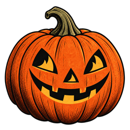
“Vintage” is not one filter or one shade of orange. It is a collection of decisions: how a character stands, where the line gets heavier, what the background leaves out, and how much space remains around the subject.
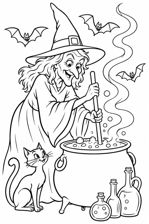
Give the character a readable shape
Classic Halloween art often makes its characters legible before the viewer notices every detail. A wide hat, a curved cloak, a bent branch, or a cat’s tail can carry the identity of an entire scene.
That is useful in a coloring page because the outline has to work both as an image and as an invitation. You should be able to understand the scene before you decide how to color it.
Use contrast with a light hand
Strong black outlines are part of the charm, but not every line needs the same weight. The most convincing pages mix bold outer contours with finer interior marks, creating a rhythm that feels drawn rather than mechanically repeated.
Keep the palette intentionally small
Vintage-inspired color works best when it feels edited. Pumpkin orange, warm cream, charcoal, muted gold, and one unexpected accent can say more than a rainbow of equally loud colors.
- Use one dominant color to establish the mood.
- Reserve the brightest accent for the focal point.
- Let dark areas create pauses between details.
Let the background support the story
A good Halloween background does not need to explain everything. A few clouds, a fence, a crooked house, or a single bare tree can suggest an entire world while keeping the page open for coloring.
The feeling comes from the details you choose — and the details you trust the viewer to imagine.
Finish with material, not noise
Paper grain and small irregularities can make a digital page feel tactile. The trick is to keep them quiet enough that the illustration remains the hero.
When all of these choices work together, the result feels like something discovered in a drawer: familiar, slightly odd, and worth spending time with.