Colored pencils are a lovely match for Halloween line art. They are easy to control, travel well, and let you move from a pale wash of color to a rich, storybook shadow without changing tools. If you have ever searched for how to color Halloween pages and found advice that assumes you already know how to blend, start here: choose a few colors, use a light hand, and build the image one layer at a time.
This guide walks through paper, pressure, layering, simple shading, and three seasonal palettes. The aim is not to make every page look professionally rendered. It is to help a pumpkin feel round, a night sky feel deep, and a vintage illustration feel warmly yours. If you are still choosing a design, browse our Halloween coloring pages collection or compare styles in the guide to choosing a Halloween coloring book for adults.
Start with the right paper and a light touch
For printed pages, ordinary copy paper is fine for a first try, especially with light pressure. If you plan to layer several colors or blend heavily, use a slightly heavier, uncoated paper that accepts pencil without feeling slick. Always test a corner first: paper texture changes how easily pigment builds, and some printer papers show indentations if you press hard.
Hold the pencil a little farther from the tip and begin with small, relaxed strokes. Keep the first layer pale. You can always add more pigment, but a deep mark is difficult to lift cleanly. A sharp point helps with tiny details such as stars, window frames, and leaves; a slightly rounded point lays down softer color across broad areas.
Use layers instead of pressure
Layering means placing several light passes of color over one another. It gives you smoother coverage and more control than pressing hard in one pass. Start with the lightest color, add a middle tone, then place the darkest shade only where the form turns away from the light.
- Map the light: decide where the imaginary lantern, moon, or window light comes from.
- Lay down a pale base: cover the shape with gentle, even strokes, leaving a small highlight area uncolored.
- Add a middle tone: follow the shape of the object — curved strokes on a pumpkin, short strokes along a leaf, and broad strokes across a cloak.
- Deepen the shadow: add a darker related color on the side farthest from the light, beneath overlaps, and near the ground.
- Unify softly: glaze a light version of the base color over the transition if the paper still has visible gaps.
Work in more than one direction when filling a large area. Cross-hatching lightly in a second direction can even out white pinholes, while keeping every stroke curved can reinforce the form. Try these steps on a spare shape before moving to a detailed illustration.
Make pumpkins look round
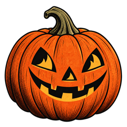
A pumpkin is a perfect practice subject because its ribs already suggest where the shadows belong. Use a pale yellow-orange as the base, a true orange through the middle, and a muted rust or reddish brown in the grooves and along the lower edge. Keep a slim highlight on the side facing the light. Follow the curve of each rib with your strokes rather than coloring straight across the whole pumpkin.
For a more vintage feel, soften the brightest orange with ochre or warm cream. Add a quiet olive green to the stem and a little brown where it meets the fruit. Our guide to Halloween pumpkin and jack-o'-lantern coloring pages has more scene ideas, while these Halloween color palettes help you choose tones that work together.
Create a moonlit scene without coloring everything black
For a witch, black cat, or haunted cottage beneath a moon, use navy, plum, charcoal, and a little muted blue-violet instead of filling every shadow with pure black. Leave the area around the moon or a lit window lighter. A narrow edge of warm gold on a roof, hat, or branch can suggest reflected light and make the scene feel dimensional.
Reserve your darkest pencil for a few anchor points: the underside of a brim, a cat's silhouette, the space between branches, or the far side of a cauldron. When the deepest dark is used sparingly, the page keeps its detail and the lighter colors appear brighter by contrast.
Three easy Halloween pencil palettes
- Harvest porch: pumpkin orange, golden ochre, cinnamon, moss green, and warm cream.
- Moonlit witch: midnight blue, dusty violet, smoky gray, muted gold, and a small touch of terracotta.
- Vintage postcard: brick red, faded teal, parchment, olive, and soft charcoal.
Limit the main palette to four or five colors, then repeat them in different parts of the image. The orange on a pumpkin might return as a ribbon; the teal in the sky might reappear in a window shadow. Repetition helps separate colors feel like one considered scene. For more combinations, see our full pumpkin, midnight, and vintage palette guide.
Blending, highlights, and small details
You do not need a special blending tool. A pale pencil from the same color family can gently smooth two neighboring layers; use light circular strokes and stop before the surface becomes shiny. A colorless blender can work on suitable paper, but it may burnish the tooth and make later layers harder to add. Test first, and remember that a little paper texture can make an illustration feel more like an old printed page.
Leave highlights as paper whenever possible. A small crescent on a pumpkin, a line along a glass bottle, or a bright edge on a hat is often more convincing than adding white everywhere. If you want extra sparkle, use a white pencil sparingly after the main colors are complete.
Common mistakes — and gentle fixes
- Pressing too hard too soon: return to light layers and save firm pressure for a final accent.
- Using the same intensity everywhere: keep backgrounds softer than the main character or object.
- Coloring every space: intentional white paper can act as moonlight, mist, or a highlight.
- Over-blending: stop when the colors feel connected; a little pencil texture adds charm.
- Choosing too many colors: set out a small palette first, then add one accent only if the page needs it.
There is no wrong palette for a personal coloring session. If you prefer bright candy colors, use them. If you want a quiet page in charcoal and cream, let it stay quiet. A useful technique should give you more choices, not turn a relaxing activity into a checklist.
Frequently asked questions
Can beginners use colored pencils on Halloween coloring pages?
Absolutely. Start with a simple page, a small palette, and light pressure. Layering is forgiving because you can gradually darken an area.
How do I blend colored pencils smoothly?
Build two or three light layers, then use a pale pencil from the same color family with gentle circular strokes. Paper texture and pencil quality affect the result, so test before working on a finished page.
What colors work best for vintage Halloween art?
Try softened versions of seasonal colors: terracotta, ochre, parchment, faded teal, olive, plum, and charcoal. A small amount of brighter orange or gold can provide a focal point.
What is the best way to color a pumpkin?
Follow the curved ribs with your strokes, keep one side lighter, and place rust or brown in the grooves and lower shadows. Several light layers usually look rounder than one heavy layer.
Find a page that feels like October.
Explore nostalgic Halloween artwork in the collection or take the coloring session with you on iPhone.