A pumpkin patch coloring page can look simple at first: rounded fruit, curling vines, broad leaves, and perhaps a fence or a moonlit hill. The satisfying part is making the scene feel like a place. A little variation in pumpkin color, a shadow tucked between two ribs, or a quieter background can separate the foreground from the far rows and give the whole illustration a gentle autumn atmosphere.
This guide focuses on the coloring decisions that make a pumpkin patch read clearly, whether you are using pencils on paper or coloring on an iPhone. If you are choosing a design first, our broader guide to Halloween pumpkin and jack-o’-lantern coloring pages covers subjects and page styles. Here, we will work through one harvest scene step by step.
Look at the scene before choosing colors
Before you begin, find the largest or most noticeable pumpkin. It may sit near the bottom of the page, have the clearest outline, or be framed by leaves. Let this be your focal pumpkin. Then notice what lies behind it: smaller pumpkins, vines, a fence, trees, clouds, or a distant house. You do not need to color every element with equal contrast. A focal point gives the scene a visual center; quieter details help support it.
It can help to divide the illustration into three loose zones:
- Foreground: the nearest pumpkins and leaves. These can have the strongest contrast and the most visible texture.
- Middle ground: the next row of pumpkins, a path, or a fence. Use clear color, but repeat fewer small details.
- Background: distant fields, hills, clouds, or trees. Slightly softer colors help these shapes sit farther away.
This is only a guide, not a rule. A flat, cheerful page can look wonderful with bright color everywhere. But if you want a more atmospheric, storybook scene, controlling contrast is one of the simplest ways to create depth.
Build a small pumpkin patch palette
A limited palette makes a busy scene easier to manage. Start with five or six colors that can repeat across pumpkins, leaves, stems, and small accents. For a warm vintage harvest look, try deep orange, golden ochre, russet or burnt sienna, muted olive, warm cream, and a dark brown or plum for the deepest accents. You can adapt the combination to the mood of the page; our guide to pumpkin, midnight, and vintage Halloween palettes explores more combinations.
Use the same color in more than one place. A touch of ochre on a pumpkin can return in a dry leaf or the light side of a fence. Olive can appear on vines and several leaves. These small repetitions make the picture feel connected, even when every pumpkin is a slightly different shade.
For a moonlit scene, keep the orange family but cool the shadows with muted violet, blue-gray, or deep brown. For late-afternoon warmth, lean on gold, rust, cream, and moss green. The goal is not to fill the page with every Halloween color; it is to choose a few that make the scene feel like the same moment in the same place.
Shade each pumpkin along its ribs
The grooves on a pumpkin are useful guides. They show how the fruit curves, so let your marks follow them instead of shading the pumpkin as a flat circle. Begin with a light base color. Add a slightly darker orange or russet in the narrow valleys between the ribs, along the underside, and where one pumpkin overlaps another. Leave a lighter band on the rounded face of each rib. A few gentle layers are usually more convincing than one heavy dark stripe.
- Lay in the middle tone. Cover the pumpkin with a light, even layer, leaving the brightest area mostly untouched.
- Mark the form. Add warm shadow to the grooves and the lower edge, following the curve from the stem toward the base.
- Blend gradually. Feather the shadow into the base color so the transition stays soft. Keep the deepest marks near overlaps and creases.
- Return to the light. Add a second pale layer to the rounded ribs if the surface needs more separation.
There is no need to outline every rib with a dark line. Let a few shadows do the work, and preserve open highlights where the light might naturally land. For pencil-specific layering and blending, see our practical guide to coloring Halloween pages with colored pencils.
Make the pumpkins different without losing harmony
When every pumpkin is the same bright orange, a patch can become one large block of color. Give the fruit modest differences instead: one can lean golden, another russet, one pale cream, and a smaller one muted green. If the page includes jack-o’-lanterns, save the strongest orange for the face you want to notice first. Repeat a few colors across the remaining pumpkins so the variation feels intentional.
Size and color can work together to reinforce distance. A large foreground pumpkin might have a warm midtone and a deeper lower shadow. Smaller pumpkins farther away can use lighter, less saturated color and fewer dark accents. The drawing already establishes scale; your color choices can gently support it.
Color leaves, vines, stems, and soil
Leaves do not have to be uniformly green. Combine olive, moss, muted yellow, and a little brown to suggest late-season foliage. Keep the veins visible by coloring around them or placing a lighter stroke down the center. If a leaf sits near the focal pumpkin, a stronger green can help separate the two shapes; distant foliage can be quieter.
Stems are often more believable in a dry green-brown or warm umber than in bright green. Add a darker touch where the stem meets the pumpkin, then leave a small lighter edge if you want it to appear rounded. Vines can echo the same olive or brown used in the leaves. For soil, fence boards, or a path, choose a neutral that lets the pumpkin colors remain the main event.
Small accents matter most when they are repeated with restraint. A few warm leaves on the ground, one pale fence rail, or a soft light in the distance can finish the scene without competing with the pumpkins.
Keep the background behind the patch
Background color can quietly establish the time of day. Cream, dusty peach, and muted gold suggest a warm evening. Blue-gray, plum, and charcoal create a later, more mysterious mood. If the page includes a large sky, resist the urge to make every cloud equally bold. A lighter area behind the focal pumpkin or tree can make the silhouette easier to read.
For a distant tree line or hill, soften the contrast and detail. A little less saturation often helps shapes recede. Keep the darkest marks for the nearest overlaps, a few branches, or the base of the pumpkins. If you enjoy stronger night scenes, our guide to choosing a Halloween coloring page for a quiet autumn evening offers ideas for matching a page to the mood you want.
Choose a coloring tool that suits the page
Colored pencils give you control over the grooves, small leaf veins, and gradual shadows. Build color in light passes and use a sharp point for narrow spaces. Markers can make pumpkins vivid and consistent, especially on larger shapes, but test the paper first and place a protective sheet behind a printed page; our guide to using alcohol markers on Halloween coloring pages explains the trade-offs.
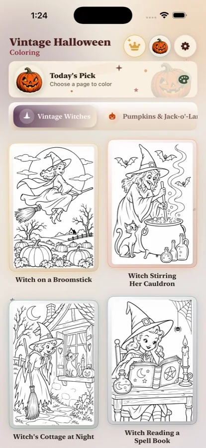
Digital coloring can be convenient when you want to try several color directions without preparing paper and supplies. On iPhone, the Vintage Halloween Coloring app includes a fill tool, brush, eraser, zoom, undo, and palette choices for its illustrated pages. You can block in the large shapes, zoom into small details, and change a color if the first attempt does not fit the scene. See the Halloween coloring app for iPhone or browse the adult Halloween coloring collection to learn more about the artwork.
Common pumpkin patch coloring mistakes
- Using one orange everywhere: vary warmth and value while repeating a few palette colors.
- Making every groove equally dark: reserve the deepest shadow for overlaps and the underside.
- Coloring the whole background at full strength: soften distant details if you want the foreground to stand out.
- Adding detail before the big shapes feel balanced: finish the main pumpkins and broad color areas first, then add veins, fence marks, and small accents.
- Trying to fill every white space: open paper can act as light and help an illustration breathe.
A pumpkin patch coloring page does not need perfect shading to feel finished. If the main pumpkin is easy to see, the colors feel related, and the background supports rather than overwhelms the scene, the picture already has a clear point of view.
Frequently asked questions
How do you color a pumpkin patch coloring page?
Choose one pumpkin as the focal point, use a small palette with several related orange or harvest hues, shade the grooves between the ribs, and soften colors on pumpkins farther back.
How do I make pumpkins look three-dimensional?
Keep a lighter strip on the rounded face of each rib, deepen the narrow grooves and lower edge, and blend the shadow gradually into the middle tone. Follow the curve of the pumpkin rather than shading it as a flat circle.
Do all pumpkins in a coloring page need to be orange?
No. Mix warm orange with muted gold, russet, pale cream, or soft green. Repeating a few hues across the scene keeps the patch cohesive while making individual pumpkins easier to distinguish.
Which tools work well for detailed pumpkin coloring pages?
Colored pencils are useful for gradual layers and narrow grooves. Markers give bold, even color but should be tested on the paper first. A digital coloring app makes it easy to try different pumpkin palettes and undo a choice.
How can I make the background look farther away?
Use slightly softer, lighter, and less saturated colors for distant pumpkins, trees, or hills. Keep the clearest edges and strongest contrast on the foreground or focal pumpkin.
Find your next vintage Halloween scene.
Explore illustrated pumpkins, witches, cats, and storybook details in a coloring app made for iPhone.