Halloween skeleton coloring pages for adults can be much more than skulls and black backgrounds. A skeleton might dance beneath a harvest moon, wear an old-fashioned suit, play in a brass band, or step through a storybook graveyard. The line art sets the scene; your colors decide whether it feels lighthearted, antique, theatrical, or quietly gothic.
This guide helps you choose the right kind of skeleton coloring page and color it with intention. You will find ideas for bone tones, clothing, scenery, and limited palettes, plus a simple order of work that makes detailed Halloween art easier to finish. The goal is not anatomical accuracy. It is a page with mood, contrast, and a little personality.
Choose a skeleton page by mood, not just by subject
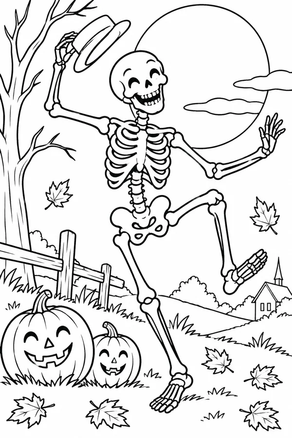
Before choosing colors, notice what the illustration is asking for. A single skeleton with open space around it is a shorter, more graphic project. A character among pumpkins, trees, fences, and a moon has several visual layers to explore. An ornate interior or patterned costume rewards a slower session.
- Playful vintage: dancing bones, a top hat, a pumpkin patch, or a moonlit village. Try warm paper colors and a few nostalgic accents.
- Storybook spooky: a skeleton on a path, near a cottage, or among leaves and lanterns. Use glowing windows and a deep but not fully black sky.
- Gothic and dramatic: a crypt, grand staircase, candlelit room, or elaborate costume. Build strong value contrast and reserve bright color for a few focal details.
- Pattern-led: repeated bones, ornate borders, or a skull mandala. Repeating a small set of colors helps the pattern feel deliberate.
If you are unsure where to start, choose a scene with one clear focal character and a few recognizable Halloween details. Our wider guide to Halloween coloring pages by theme compares witches, pumpkins, cats, ghosts, skeletons, and haunted houses by mood and level of detail.
Make bone color feel warm rather than flat
Pure white is an obvious choice, but a whole skeleton colored white can disappear against the page. Begin with warm ivory, cream, or pale parchment. Leave a few small areas of the paper untouched as highlights, especially on the forehead, ribs, hands, and knees. A light layer of warm gray or muted beige can separate overlapping bones without making them look dirty.
For a cooler moonlit scene, use a whisper of blue-gray or lavender in the shadow side of the skull and rib cage. Keep the shadow light and consistent: if the moon is behind the figure, the far side of the body can be slightly cooler, while the edges facing the moon remain pale. You do not need to shade every bone. A few repeated shadow accents are enough to suggest form.
Try this simple bone-color recipe:
- Lay down a light cream or ivory base, leaving the brightest highlights white.
- Add a second, soft layer of beige or gray where bones overlap.
- Use one restrained cool shadow color for the underside of ribs, eye sockets, joints, and the side away from the light.
- Step back and check readability. Keep the bones lighter than the costume and background.
Use clothing to give the skeleton a personality
A costume is a useful place to add color without crowding the bones. A black top hat with a rust band feels classic; a burgundy coat can make a character look theatrical; faded teal or olive can suggest an old postcard illustration. If the page includes a bow tie, scarf, waistcoat, or shoes, repeat one accent color across two or three of those details.
Patterns can be simple. Add narrow stripes to a jacket, a few gold buttons, or a colored ribbon around the hat. Keep the pattern scale appropriate to the drawing: tiny marks can become busy in small spaces, while a broad area of color gives the eye somewhere to rest. A restrained costume often makes the skeleton feel more expressive than adding many unrelated bright colors.
Build a Halloween background with three values
For a readable scene, think in three broad values rather than coloring every object with equal intensity:
- Light: moon, bone highlights, lit windows, and the faces of pumpkins.
- Middle: leaves, clothing, fences, hills, and most of the setting.
- Dark: the night sky, tree branches, deep windows, and a few edges that frame the scene.
This light-middle-dark structure helps a skeleton remain visible even when the background has many details. If the illustration already has dense linework, color larger shapes first and keep small leaves or stars as accents. For broader autumn combinations, explore our guide to pumpkin, midnight, and vintage Halloween color palettes.
Four palettes for adult Halloween skeleton art
Vintage harvest
Pair parchment bones with rust, olive, muted teal, and charcoal. Add old gold to buttons, leaves, or a pumpkin stem. This palette suits dancing skeletons and harvest scenes without making everything orange.
Moonlit midnight
Use ivory, blue-gray, midnight navy, dusty plum, and pale yellow. Keep the brightest yellow near the moon or windows, and let navy carry the largest dark areas.
Cabinet of curiosities
Combine cream, oxblood, deep green, aged brass, and warm brown. This works especially well for costumes, books, candlelight, and detailed interiors.
Playful postcard
Choose pumpkin orange, faded turquoise, soft lavender, cream, and a small amount of black. Let one or two colors repeat across the skeleton’s accessories and the surrounding scene.
A steady order for coloring a detailed skeleton page
When a scene contains a character and a full setting, it helps to color in passes. First choose the palette and mark the light source. Next color the large background shapes, such as the sky or ground, while avoiding the figure. Then work on the bones and costume, moving from large surfaces to small details. Finish with pumpkins, leaves, buttons, stars, and other accents.
Colored pencils make it easy to build soft shadows gradually; fine-tip markers are useful for crisp, saturated areas but can overwhelm tiny details if pressed too hard. Test a color in a margin or on scrap paper before using it in a small section. Our practical guides explain layering with colored pencils and choosing markers for Halloween coloring pages.
Digital or printed skeleton coloring pages?
Printed pages are a good fit when you want pencil texture, a physical keepsake, or a screen-free evening. Use a test print to make sure thin outlines stay clear, and choose paper that suits your medium. Digital coloring is more convenient when you want to zoom into small bone details, test several palettes, or undo a color choice without starting over.
Vintage Halloween Coloring is an iOS app with nostalgic Halloween scenes, including a cheerful dancing skeleton. The app is a digital coloring experience rather than a bundle of downloadable skeleton PDFs. If that format suits you, visit the Halloween coloring pages collection or read our guide to Halloween coloring apps for iPhone.
Frequently asked questions
Are skeleton coloring pages for adults always scary?
No. Skeleton art can be playful, elegant, vintage, theatrical, or gothic. A dancing character or storybook scene can feel festive; stronger shadows and elaborate architecture create a darker mood.
What colors should I use for skeleton bones?
Try warm ivory, parchment, cream, or pale gray instead of filling every bone with pure white. Add a small amount of beige or blue-gray shadow where bones overlap, and leave a few highlights uncolored.
How do I make a skeleton page look vintage?
Use a limited palette such as parchment, rust, olive, faded teal, burgundy, and charcoal. Repeat the same colors across clothing, pumpkins, leaves, and scenery so the page feels cohesive.
Can I color Halloween skeleton art digitally?
Yes. Digital coloring makes it easy to test palettes, zoom into small areas, and undo a choice. Printed pages are better when you want the texture of pencils or a physical finished sheet.
Meet the Skeleton Society.
Color a cheerful vintage skeleton, then bring your own palette to pumpkins, moonlight, and the rest of the October scene.